Architecture Project
Coffee'd Bridge |
DNL Bridgeway |
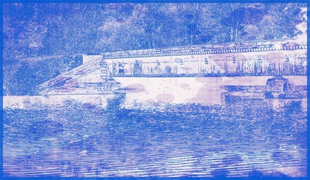
This was the first blueprint I made. I used the paper that had a coffee spill on it to show a more beat up, used feeling to the design. The water did not help the blueprint design of the picture. The amount of edges it has draws away from the focus which is supposed to be the bridge.
|
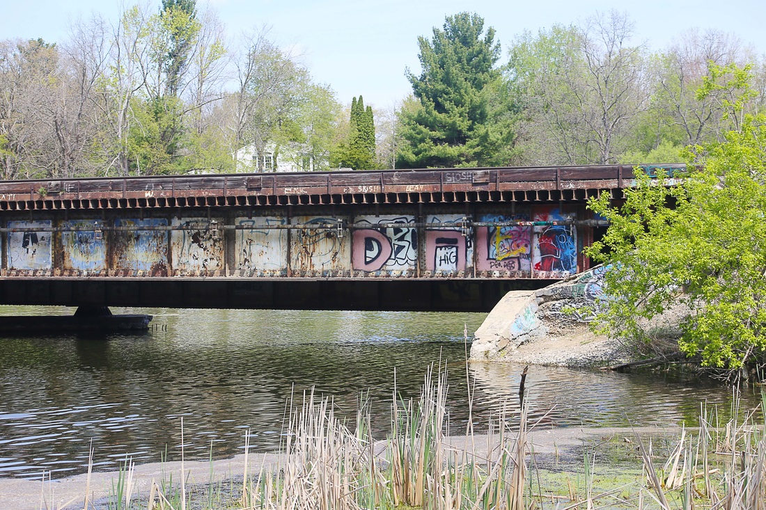
Since we were taking pictures of architecture, I wanted to take pictures of a bridge. This bridge was the most visually appealing and the most accessible one I could get to. I changed to vibrance and contrast to emphasize the colors of the picture.
|
Doodle Art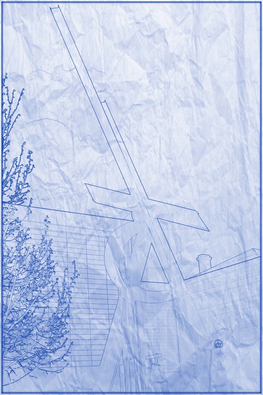
I do not know what this piece is called. I came across it when I was walking down state street taking pictures of miscellaneous architecture. I added a crinkle paper to the blue print to bring out character when the structure became more of a silhouette.
|
Modern Art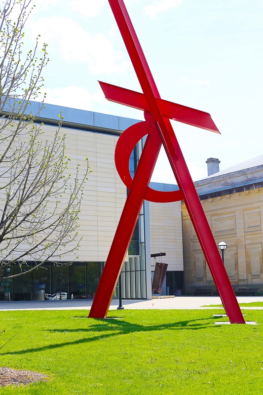
I called this picture modern art as I do not know its name. The painted steel looks like a cross between three letters, an A, C, a T. I used curves to lighten up the picture and vibrance to make the picture more visually appealing.
|
The Idea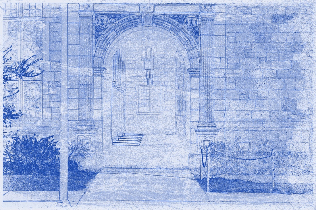
This picture was called the idea as it shows an outline. This should the potential of a structure, a passageway. But it is a blueprint, it is incomplete, it is not perfect. That is what I am trying to convey in this photo. I used parchment as the paper to show an older, more tame approach, the back was blurred to create an air of mystery or entropy.
|
The Result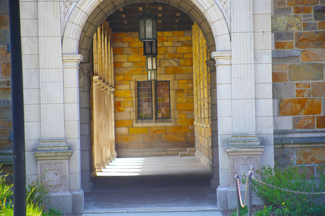
This is the payoff, the result or hard work. This picture shows that what the passageway looks like. Only minor adjustments were made. I used curves to brighten the picture, vibrance to enhance the colors, and contrast to smooth out the photo, make it less intimidating.
|
Triangular Stairs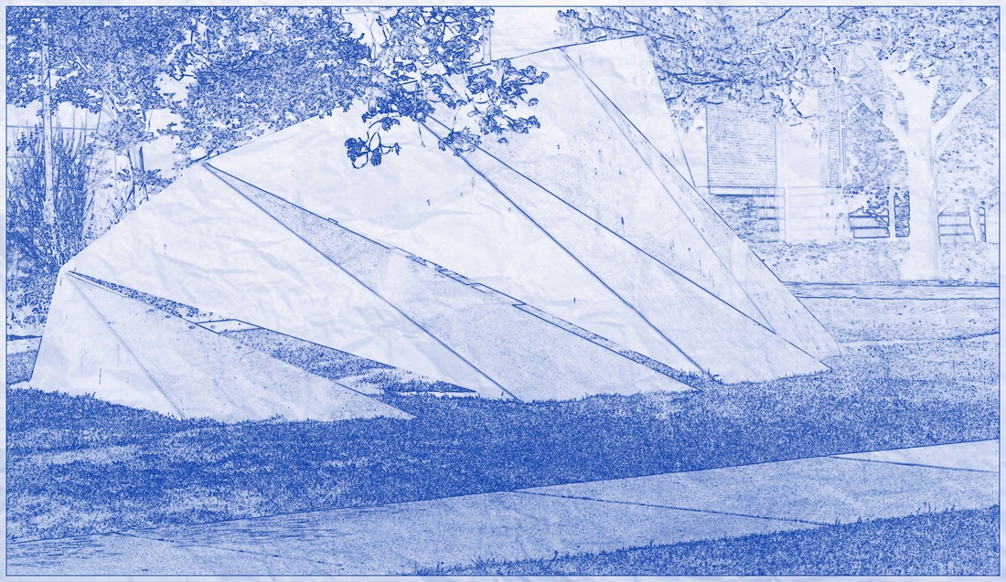
I used to climb this object during the Art Fair when I was younger. I saw this when I was near the Law Quarter of campus and snapped a few photos. The crinkled paper was used again, but softened to show slight use. The grass took up most of the edges and the object remained largely unmarked, unlike the bridge earlier, this fact benefited the image.
|
Stair-Like Pyramids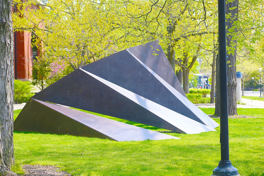
I do not know what this piece is called. I gave it the name Stair-Like Pyramids because the art looked exactly like that. I increased contrast to bring out different aspects. The grass became greener and the metal looked even more grayish brown when I increased the vibrancy.
|
State's Law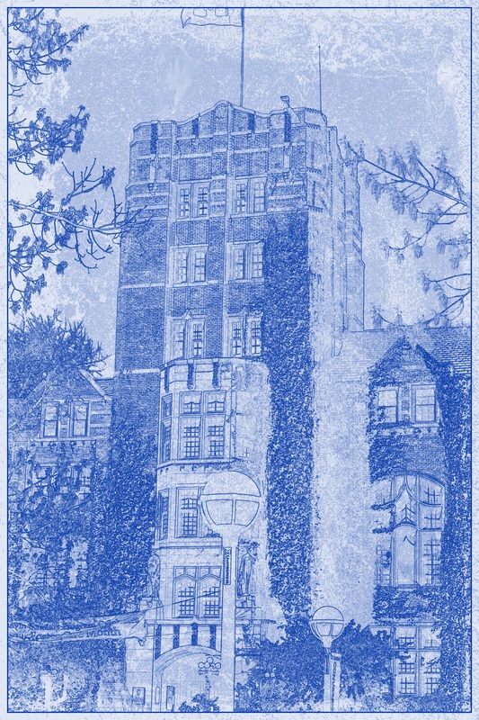
The bricks and ivy worked well together when mashed into a blueprint. This picture took more effort as there were tiny images of a company spread thought the paper used. This picture was probably my most successful Architecture picture as it has the best blend of overgrowth and inanimate objects.
|
Encroaching Growth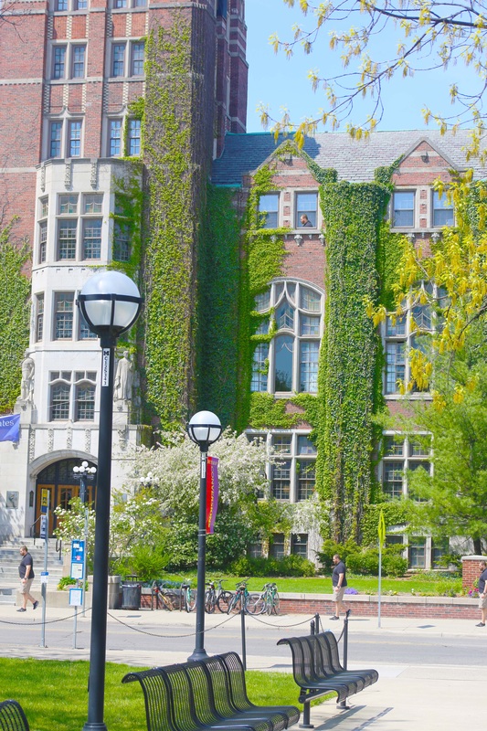
This picture was called Encroaching Growth as it has a great meld of plants. mortar, and pestle. This was the last picture I took on my walk down state street. I was up against a wall so fitting the entire building within the aperture was not the easiest task. I used vibrance to better show the colors of the image and curves to make the image look like midday, rather than early afternoon.
|
